I'm refreshing the art hanging on the walls at home at the
moment and I have an offer for a hugely discounted canvas print over at the
Canvas Factory. The wall space is approximately 1 metre wide and I've decided
on one of my own landscapes to get printed up. I'm having a dilemma however, as
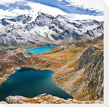
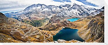
I have two images to choose from. Actually, two images that I've narrowed it
down to. Of the same location - the two lakes at Nivolet called, Agnel and Serru', the scenery is absolutely magical and one I'd love to see hanging on my wall as a reminder of the great times we had whilst in Italy in 2010.
To view larger, as for some reason I can't get the linking to work with this image, please click here.
* * *
So, do I choose the landscape orientation or the 5 image panorama of the same location? Which would you choose? And why? I would love to hear your theories on what would work best in the space I have allowed.


2 comments:
The Landscape.
Sure, with the panorama you fit more in, which is fine, but I think the composition of the landscape shot is stronger, with the water and the clouds leading your eye from bottom-left to top-right.
Also, in the pano, it feels like the water is too close to the bottom edge of the frame.
Thanks Drew, I've checked through my files from the day and I don't have any shots with more space near the lake at the bottom of the frame - such a shame... I'm also looking at the wall space and wondering if landscape may be the best option. I really appreciate your insight in this!!
Post a Comment