Showing posts with label photograph. Show all posts

Monday, 14 January 2013

How to Watermark your Images

It's about this time of year that I consider updating the watermark I use when I add images to sites such as Flickr. The trouble with this is that I can never seem to remember how I did the previous one... Add to that, I've also been asked by a couple of friends to show them how to add watermarks to their images, so I thought I'd write a step-by-step of how I created this current watermark.


ladybird I 

1. Choose a font, any font, preferably one you like and that can be a sort of signature for you. No doubt you have hundreds of fonts on your computer, so open up a document, type your name (or whatever text you want to use for your watermark) and have a play with the fonts you already have. If you're not happy you have The Font, then turn to the internet - that's what it's there for! I found this font from dafont and it's called znikomit No24 by gluk. The swirly frame was one I had made and used for a previous project, but you don't need to use a frame for your watermark.

2. I use PS but I'm sure that any photo editing software can be used. (These instructions will be PS oriented.) Open up a new file to a size of 4300 x 2300, set layer to white. But to be honest, the size can be approximate, as you'll re-size the watermark down to size according to each image you watermark.

3. Select the text symbol and then select a text colour. I've chosen #a6a6a6 for mine. Type your name on that layer.


4. Go to your Layers menu and select Blending Options. Because the font I have chosen is quite fine, I've selected Bevel and Emboss as well as Drop Shadow. Depending on the font you choose, you may find this step unnecessary. I have also selected Colour overlay and set it to negative image.
 

You can see the effect of the blending options on a heavier font:


5. I added my swirl frame on a new layer and inversed the colours (it was black, inversed to white) then applied the same blending option as above:


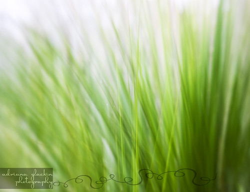
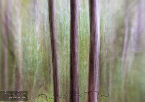
At this stage, it's still too 'dainty' and almost invisible on even the plainest of images. This won't be the case if the font you have chosen is bulkier. If you have chosen a dainty font and/or frame, simply duplicate both the text and frame 2 or even 3 times. Practice popping the watermark on one of your images to see if you're happy with the effect. You may find that you don't need to duplicate the blending effect on each duplicated layer, so simply disable the blending option as you see fit.

6. Once you're happy with the watermark, it's time to group all the layers together using the "Create a new Group" option in the Layers palette (red circle). Drag each layer onto the new folder (green circle). You will notice the Blending Mode is now "Pass through". Save this as a .pdf file:


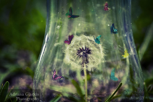
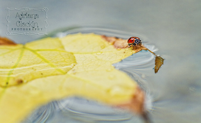
7. Time to grab one of your images and test out your new watermark. Grab your folder, you'll notice I've called mine "ZNIKO grey" and copy that to one of your open images. How you size the watermark, where you position it and how you blend it to your photo will depend on each image and of course your own personal preference:


So now you should be good to go. I hope you've found this How To easy to follow and implement..

What are your thought on watermarks? Do you use them?  If not, I'd love to hear why. 
 
If you have any questions, drop me a comment.

Friday, 27 January 2012

Week 4 ~ "From a High Angle"


 super scruffy
Not your usual interpretation of this phrase, but I wanted to create something that was a little bit of fun and a whole lot of silliness. I had seen an image where the object was overlaid onto a blackboard background - but do you think I can find it again so I can link you? No! It's been bugging me all week and I've tried all the keyword combinations to no avail. If you've seen other examples, I'd love for you to link me to them. Just pop the link in the comments :)
You'll be surprised to know that I didn't hire a Cessna and launch my dog from it in order to create this image. The 'high angle' in this shot, involved me standing on tip toes on a kitchen chair. I had my dog lay on a piece of green fabric then I arranged a red t-shirt above him so it would look like a superhero's cape. In PS, I erased the green background and then duplicated the dog layer onto a drawing I had done and scanned into PS. I added a couple of textured layers and then applied a fake TtV brush I had made in PS over the top of the previous layers. To create the impression that Super Scruffy is flying, I duplicated the back portion of him and pasted that onto a new layer then applied motion blur to the new layer. A few more tweaks with curves and some dodging and burning and this is the final result.
Another week is done. You know, the scary thing about a project like this, is it forces you to notice the passing of time. People, we are already four weeks into the new year....gulp!

Friday, 20 January 2012

Week 3 ~ RED


 ~ still life with pomegranate ~

As I mentioned in my post last week, I usually start thinking about the following week's theme while I'm still working on the current theme. The recurring thought I had with the theme of "red" was a still life. While it's possibly been done to death, I also wanted to include a pomegranate. I'm sure I would use more of that fruit in cooking if I could buy it already seeded. I know that it is available as I've seen Nigella use the pre-packaged seeds, but I've not been able to find it, so maybe it's a UK thing and not an Australian thing. So, back to the still life, I've also included a lighting diagram to show you the set up. I used a black background, not white as per the diagram and at one stage I toyed with a red gel, but that didn't look effective so i removed it.  I absolutely resisted the urge to use any textured layers to give it an aged or painterly feel - I wanted a straight-up image for this week's theme.  Short and sweet this week, I hope you like it. Bring on week 4!

Tuesday, 17 January 2012

Week 2 ~ Clouds


Last week's theme for the 52 Captures was "clouds". As I'm only committing to one photo a week with this project, I didn't want to simply take a photo of clouds. My intention, in doing this project, is to push myself creatively and photographing a landscape with photogenic clouds wasn't what I was after. And a very big thank you this week to Aerokev, who I have roped in encouraged to participate in this challenge.

 ~ the heart cloud ~

I had an idea floating around in my head and I simply had to rely on there being suitable clouds. So here's the workflow that took place over a series of days:

* Photograph clouds for 3 days in a row. The weather was conducive to gorgeous white scattered clouds that popped with detail when using the polarising filter.
* As often happens with an idea, I need to see it take shape in my imagination before I can actually then try and create it. Pondering the idea and how it will come together while sipping coffee and eating chocolate works for me...
* Time to upload the images and print up a contact sheet full of clouds. I then picked out the appropriately shaped ones and edited them in PS. The main shape I was after was a heart and it was a matter of putting the cloud jigsaw together.
* And of course, as often happens, what I imagined was not translating onto the screen. I did persist with the idea and instead of ending up with a sweet collage of abstract cloud images; I ended up with a very early 70's evangelistic, very bad stained-glass-effect that still makes me shudder when I view it. I dislike it so much that I don't dare upload it anywhere! Idea scrapped.
* Onto the next idea - I still wanted to keep the idea of a collage of clouds, this time though, I wanted the clouds to be floating up in the sky. I use a drawing program and so had to draw the grassy foreground, the string and sky. I then imported the files into PS and began blending the images together.
* It's important to blend the various elements so that they all look as though they belong, and this is where adding textures (my own used) comes in handy. I used 3 different textures, blended them in various modes (overlay, soft and multiply at varying opacities).
* The heart cloud still didn't look quite right, maybe if it was a little rounder and 'flyaway', and this is where the Liquify Filter in PS comes in handy. I used the bloat tool and found I needed several attempts before I was happy with the result; it's not a tool I use a great deal in PS.
* My now bloated heart balloon was taking shape (sorry...). I used the Warp Tool to make the string 'fit' the balloon. I also added a subtle Drop Shadow to the balloon to create a bit of distance between it and the sky.
* To create the shadow in the grass, I used the Burn Tool - in a separate layer - and burnt the shadow into the grass.
* Some final tweaking with curves and vibrancy and the image was done.
I should point out, that I was working on 4 versions of this at the one time - as I couldn't decide which version I preferred. The one I uploaded to the group wasn't the actual version I had settled on! Oops! As I don't know how to change it, there it remains.

The version I uploaded to the 52 Capture Group, a slightly muted, more sombre version.
Onto week 3 where the theme is 'RED'.

Saturday, 7 January 2012

A New Year - a New Project

 
Well, well - Happy New Year! Did you make a New Year's resolution? No, neither did I. I only get disappointed when after a few days I abandon the resolution, so it's easiest not to even make one! I have embarked on a new photographic project though - and I can't tell you how pleased the family is about this! I've told them that it won't be as tough as Project365; this one only requires 52 photos - that's easy, right?
So with one day to go before the first deadline, I set about completing the task for week 1. Of course week 1 would be "self-portrait" but I decided to combine an idea for another challenge and create one photo. Some might say that's being lazy, I prefer to think of it as creative! The other challenge's brief was two-fold - "A new beginning" plus "texture".  So with those criteria in mind, I set about capturing the image. Setting up the lights and umbrellas, positioning the camera, taking test shots, then hair and make-up and then at the last minute I decided to change the lens. I swapped the nifty-fifty to the Lensbaby Composer which meant I had to grab a prop to sit where I would be sitting and find the focus spot.  After quite a few attempts and some fine tuning of the lens, I managed to get my eyes tack sharp, which was my aim. I then scoured through my 50's magazines to find an appropriate kitchen shot, in colour - it's wasn't common for magazines to be in full colour then; scanned the image into PS and incorporated that into my photo. I played with the individual curve layers to create a discoloured and retro look, before then scanning in some old and textured paper. I find that scanning rather than photographing the paper yields better results, as you can really bump up the dpi quite a bit. I used 3 of my old papers and applied them in soft light, overlay and multiply at varying opacities. I then added a couple of text layers and added the text, using retro fonts in keeping with the retro theme. Lastly, I felt it still needed a little something so I drew the retro starbursts and created some vignetting. From start to finish it probably took about 4 hours and I probably would have kept fiddling with it, but when you're working to a deadline, there comes a point where you need to stop.
I'll keep you up to date with each week, posting the image and blurb here, as well as posting the image over on Flickr. If you've started a Project52, link to it here, I'd love to follow your progress - and maybe I can link you in the side bar. The best part about the Project52 I'm following is the fact the weekly theme is spelled out for us - yeh! So, here's to 2012 - may you enjoy many creative moments and may you be surrounded by those you love.

Friday, 14 October 2011

I'm Sorry, But What Season is This?


I'm a little confused. My calendar tells me that this is mid October, yet I'm still wearing winter woollies. Normally at this time of year, I would expect soaring blue skies and temperatures in the low to mid 20's. Yet today, like many days this week and last week and the week before, the temperature struggles to get to 20 degrees and it's bleak and dreary.  Don't get me wrong, I LOVE the mist and fog, but it does get a little tedious. I can really only recall a couple of fine Spring days so far this season, the rest really have been quite blergh. This afternoon I ventured out and about and went for a bit of a bush walk. There are only so many hours you can spend indoors.

I used the Lensbaby Composer with f5.6 aperture disk then converted to black and white in PS. The abstract colour images were various grasses and bushland, and the effect was achieved in-camera.

I hope that wherever you are in the world, your weather is a little brighter, sunnier and cheerier than the weather I'm currently experiencing.


~ waiting for the sun to start shining ~ 

  mist & fog in springtime_2 

  mist & fog in springtime_3 

  mist & fog in springtime_4 

  mist & fog in springtime_5 
 
  mist & fog in springtime_10 

  spring abstract_6 

  spring abstract_7 

  spring abstract_8 

  spring abstract_9

Tuesday, 6 September 2011

Laghi Serru' and Agnel in Landscape or Panorama print?


I'm refreshing the art hanging on the walls at home at the moment and I have an offer for a hugely discounted canvas print over at the Canvas Factory. The wall space is approximately 1 metre wide and I've decided on one of my own landscapes to get printed up. I'm having a dilemma however, as I have two images to choose from. Actually, two images that I've narrowed it down to. Of the same location - the two lakes at Nivolet called, Agnel and Serru', the scenery is absolutely magical and one I'd love to see hanging on my wall as a reminder of the great times we had whilst in Italy in 2010. 

To view larger, as for some reason I can't get the linking to work with this image, please click here.


* * * 


So, do I choose the landscape orientation or the 5 image panorama of the same location? Which would you choose? And why? I would love to hear your theories on what would work best in the space I have allowed.

Thursday, 7 July 2011

The Runaway Plastics - Where Do They Go?

mis-matched plastics

Why is it that no matter how often or how recently you tidy your plastics cupboard, the number of containers and the number of lids never seem to match?  I would like to declare that my plastics cupboard is tidied often, but that would be a big fat fib. It is only when I reach the stage of sheer frustration of not being able to close the cupboard, or find a lid, or find the right size container, that I empty the whole cupboard out and begin to play the frustrating game that is "Find The Matching Lid!" It sounds an exciting game, especially when you say it just like a Game Show Host, and it was exciting when the Teens were Toddlers. But it's not an exciting game at all. The Teens now just look at me, roll their eyes and go back to doing what they were doing,  leaving me to play "Find The Matching  Lid!" on my own.

How is it possible that even though bases and lids tallied up in the last tidy up and the cupboard closed effortlessly, that suddenly numerous lids don't have bases and vice versa? It's always been my policy - if it doesn't have a matching base, or there's no lid, it doesn't go back into the cupboard. It goes, instead to a new home courtesy of Vinnies. For whatever reason, this policy isn't working, as I now have bases without lids and lids without bases. Again. Sigh. I do try to maintain some kind of order, but really, it's to no avail. That and the fact there's more to life than balancing the plastics cupboard with the precision of a trust accountant.

I have a theory as to why I'll never balance the number of plastic bases and lids in my kitchen cupboards. I think that some of the sneakier lids and/or bases (as they're just as capable), manage to run off with those single sneaky socks. Those same sneaky socks that leave you with useless matchless single socks that accumulate with each load of washing. (FYI: We currently stand at one shopping bag full of variously coloured single socks).

I'd like to know whether you have this same problem of mis-matched plastics in your kitchen. How do you solve it? Do you have a better solution? Do you perform roll call each day before the situation really gets out of hand; these plastic containers are quite expensive, after all. Where do you think the runaway plastic goes to? And why is it that even though you have less than what you started with, after a week, you're back to not being able to close the cupboard? Sigh.

Monday, 30 May 2011

When Life is but a Blur

--Life can sometimes be a blur --

It was a last minute decision that found me at the 52 Suburbs exhibition at the Museum of Sydney late yesterday afternoon.  I was aware of this project thanks to twitter and was following the progress with interest. If I thought the Project365 was a challenge, then surely a challenge such as documenting 52 suburbs in 52 weeks is the ultimate. Phew! My head spins just thinking about it. I'm pleased to say the exhibition didn't disappoint, and even though it was late there were quite a few people enjoying the display.

The exhibition runs until October 2011, and allow yourself plenty of time, as there's another exhibition well worth visiting - The Enemy at Home. Recently discovered photographs taken by a German internee are being exhibited and they show life in the intern camps during WWI. The two exhibitions work well side by side and show just how much Australia has changed within the last century.

Getting back to the 52 Suburbs, there are limited edition prints available for sale as well as the book which showcases the project. For the photographers amongst us, there's also a competition you can enter that encourages you to get to know your suburb!

A brisk walk over to Allens Music to pick up some music supplies, then over to Chinatown for a quick meal before heading home and the whirlwind trip to town was over.  Of course no trip to the city is complete without a photo or two... the photo above was taken with my iPhone using the Slow Shutter App and edited using the Film Noir App.

Now, if you'll excuse me, I'm going to cosy up in bed and enjoy my copy of the 52 suburbs book.

Saturday, 21 May 2011

Hearty Soul Food

hearty soul food

Sometimes I just can’t help it; I have to photograph my food before I eat it. It’s not because my loved ones will have the evidence of what my last meal consisted of, should I be fatally struck down by food poisoning. It’s more about the colours and textures and aromas - they're simply so appealing. (Yes, I know you can’t photograph an aroma...yet) My family and friends are used to this behaviour now and when I have my camera up at my face it’s hard for me to see their eye rolls. So, this was one of my dinners from earlier this week – a simple minestrone soup. I had picked up the recipe card from my local greengrocer and added it to the other recipe cards I seem to have accumulated over the years. With the chill of autumn well and truly here, it was time to rummage through the recipe cards and come up with my own simple minestrone variation.

My ingredients included:

·         Onion
·         Leek
·         2 carrots
·         Celery
·         Cup of peas
·         Handful of beans
·         Cauliflower
·         2 x 425g tinned tomato
·         Tbs tomato paste
·         1 ½ cups of small pasta
·         1 lt of beef stock
·         1 Tbs olive oil
·         Salt and pepper to taste
·         Fresh Parmesan Cheese grated to garnish and flavour

My method:

·        *  Finely chop the onion, leek and carrots, add to the pot with the olive oil and fry until the onion and leek are clear. Stirring and taking care not to burn the onion and leek.
·         * Add the other raw vegetables and stir frequently until they brown a little.
·         * Add the stock and tinned tomatoes and tomato paste. Lower heat, place lid and allow to simmer. Stir occasionally and as the vegetables begin to soften, you can add the small pasta, stir (you may add a little water or stock at this stage), place lid and simmer until cooked.
·         * Add salt and pepper to taste and sprinkle with parmesan cheese upon serving.

Variations:

·         * You could use frozen vegetables in place of raw vegetables.
·        *  The beauty of this simple minestrone is that any vegetables you have in your fridge, freezer or pantry would be suitable to make this hearty soup. You want to end up with a bowl-full of chunky delicious vegetables and not a light and liquidy soup.
·         * If who you’re serving to, has an aversion to a certain food, you could always omit the pasta and blend the vegetables into a fine puree and serve with a dollop of sour cream. I will be cooking this variation next time as MOTH objected to the ‘ridiculous’ amount of peas in his bowl. Tsk.
·        *  Use your favourite spices, perhaps cumin, to give a different flavour to the soup. Or a generous handful of chopped basil would also be a yummy variation.
·         * If you want a meatier variation, add bacon or ham pieces to the onion and olive oil and substitute vegetable stock for the beef stock.

Importantly, once it’s cooked, don’t forget to take a photo of it before you serve it up! Oh, and if you like, post me a link to your photo. Enjoy!

Saturday, 29 January 2011

The magical world in the upturned glass

The challenge was set and the keyword was “glass”. It could be interpreted in any way, and having seen an early entry, I almost didn’t bother. How could I compete with that...and then I got to thinking - what’s the point of a challenge if I give up so easily? That wouldn’t be the spirit of it, so it was time to think hard and give it a go. Each day I would formulate an idea in my head whilst working out if I could pull it off, trying all the while to build the image in my head. In the end, I decided to pursue a dandelion idea as there was a perfect one in our lawn. Thanks to some butterfly stock over at Deviantart and quite a few adjustment layers, I’m happy with the result – a magical world in an upturned schooner glass!

Monday, 28 June 2010

How to Add Texture to Your Photographs - a simple tutorial

I’m always asked how I add textures to my images, so I thought I would write a quick and simple recipe for you with a before and after photographic example. I use my own textures, however in this example I have downloaded some free textures from Isabelle LaFrance Photography.  Isabelle has free textures as well as free actions on her blog, so go and pay her a visit.


Here is the image BEFORE:


Step 1: Download the Free Texture Pack from Isabelle’s Website and save them onto your computer.

Step 2: Open up your Photograph. I’m using Photoshop, but I’m sure you can adapt these instructions to suit Elements.

Step 3: Open up “Burst – Free” texture that you’ve downloaded and change the colours using “Colour Balance”. I altered the colour from the original terracotta/green to a blue/fuchsia.

Step 4: Add the “Burst-Free” layer to your image. (Right click on the layers dialogue box and select “Duplicate” and select the image destination you would like the texture image to be sent to).

Step 5: Go back to your original image. It should now have the “Burst – Free” layer over the top. Resize if necessary. Set this layer to “Soft Light” and to about 63% Opacity.

Step 6: Open up “Organic – Free” texture and once again change the colours to suit. I altered the colour from the original mushroom to a turquoise.

Step 7: Add the “Organic – Free” layer to your image. Resize if necessary and set the layer to “Soft Light at about 60% Opacity.

Step 8: Duplicate the Original image and position this on top of the two textured layers.  Change this layer to “Black & White” (Go to Image – Adjustment – Black & White) and set this layer to “Soft Light” at 100% Opacity.

Step 9: Open a Curves layer mask and create a very slight S-curve – to suit your taste.  And you’re done!

Step 10: If you are posting the image up on the web, and you’ve used other people’s images – then don’t forget to give credit with links back to their site.


Here is the image AFTER:
beauty is a fragile gift

Please Note: The “recipe” will alter with each and every image as well as each texture layer you apply.  While setting it to about 60% Soft Light works in this example, in another example, Overlay at 20% may be the effect you’re after.  The trick is to experiment; there is no right or wrong way to apply layers. Of all the layer effects, I tend to use Soft Light, Overlay, Hard Light, Multiply and Darken the most.

If you have any questions, then please leave a comment and I will try and answer it for you.  In the meantime - Enjoy! :-)


Monday, 1 February 2010

How different Photographic Treatments change the look of a Subject

Take a bunch of hydrangeas, a hand painted ceramic bowl, a string of pearls, a cedar table, some floaty organza and a couple of torches.  Add to this mix your favourite camera equipment and your editing skills.  Get busy and arrange the items in a pleasant fashion. And now experiment!

In the first photograph, a standard 50mm lens – the plastic fantastic, diffused torchlight, and a long exposure of a couple of seconds was used.  The diffused torchlight was used to “paint” the light onto the hydrangeas.  The brightness, contrast, levels were then adjusted in Photoshop to get this final results.

Still Life Hydrangeas - straight photo

There’s a real trend toward adding textured layers to photographs these days.  Adding textures really changes the feel of the photo.  It somehow ages the photo, giving it a real retro/grungy/moody look.  I recommend you shoot your own textures or if you really prefer, you can obtain free textures by simply searching Google for “free textures”.  I’ve used 3 different texture layers (my own) to the original image, and have blended them using varying opacities and blending modes.   I find I use overlay, soft light, hard light and multiply the most.


still life hydrangeas - textured

This image is identical to the image above - it has been layered with textures to change it's appearance to a more moody and vintage look.
This final image was shot using a very different technique – in fact it’s a blend of two techniques that I enjoy – the dreamy Lensbaby and the Through the Viewfinder techniques are absolute favourites of mine.  Different brands of Twin Reflex cameras will also yield varying results.  So, in these final two images, I used the Lensbaby Muse with the +4 macro filter; I inserted that into the “tube of darkness” which directly points to the viewfinder on the top of the Twin Reflex Camera.  Using the Muse lens, really softened the overall look of the image and the square format plus some cross-processing, gives it an aged appearance.  Follow this link if you’d like to know more about the Through the Viewfinder technique.


Hydrangea TtV - argus
Through the Viewfinder using Lensbaby Muse +macro 4 filter and Argus Argoflex Camera

Day 31 of 365
Through the Viewfinder using Lensbaby Muse + macro 4 filter and Kodak Duoflex Camera


Coming Soon - How to apply textures to your images.

Monday, 28 December 2009

Christmas Day doesn't need to be stressful...

Long gone are the days when I would stress over Christmas Day preparations. This year I adopted a laid back approach which meant the day was much more enjoyable – which is how Christmas Day should be. So what that I forgot some grocery items, like orange juice, avocadoes and shortbread biscuits to name a few, there was still plenty of goodies to eat and I really don’t think anyone noticed. It also meant I could improvise with some of the recipes.


The smoked salmon & avocado stack was still delicious despite the fact I had forgotten to buy the fresh avocadoes, yet I had some yummy avocado & salsa pre-made dip which worked quite well instead.  So what that I ruined the ham rind by cutting all the way through it – the redcurrant glazed ham was that yummy, it was devoured in two days.  So what that there weren’t the traditional shortbread biscuits to serve visiting friends and family over the course of Christmas Day and Boxing Day – the mini chocolate puddings, the delightfully decadent egg custard and those huge, juicy cherries were enough of a distraction. 


We’ve been spoilt over the years to expect food stores to be open every day and at all hours, and we panic when they are shut for just one day.  You see shoppers stocking up on food as though it will be weeks before the stores re-open.  The world didn’t end simply because I was missing some ingredients; Christmas wasn’t ruined simply because I didn’t follow recipes to the letter.  While it’s lovely to have a table full of delicious gourmet foods to serve your friends and family, we can miss the point if we make that the focus of our day.  It’s so much more important to relish the time spent with family and friends, for they are the essence of Christmas. 


Photographs taken using Lensbaby Muse - a Christmas gift - and textures photographed by me added to the original photos.

Monday, 14 December 2009

Scream Aim fire Cover

This post is purely a self-indulgent one - so, please indulge me as I share with you this little music clip. After all, a mother can boast a little, can't she?

My Teen loves his music fast and loud, and not just listening to it either. For weeks now we've been hearing his riffs as he enjoys his new Marshall amp, and a couple of weeks ago he posted his first Youtube cover. Take a listen - I hope you enjoy it!


Here he is, practising the Bullet for my Valentine piece, shot one afternoon as the last of the sun's rays danced in his bedroom.

Saturday, 12 December 2009

How Time Flies when you're having fun

Getting Ready, originally uploaded by Adriana Glackin.

The month of December always leaves me feeling a little teary and emotional. There’s more that 101 reasons why this is so. The recurring theme seems to be, however, the passing of time. How fast did this year pass, how fast have the past 5 years been, is it possible that such-and-such happened 14 years ago, is it really that many years since I finished school, I've been married for how long? – and on and on it goes. I question dates when events occurred, do the math and realise that in fact so much more time has passed than I thought. And of course, another sure sign of the passing of time is to see policemen and doctors, who were always so much older, are now in fact considerably younger – how and when did that happen? Aren’t they a little young to be fully trained?


The other sure sign of the passing of time is to see your children come to the end of another school year, and for those of us in Australia that coincides with the middle of December. If that isn’t a reminder that time flies by, add to that the milestone of reaching the end of compulsory education and you start to truly wonder where the time has gone. Our Teen has completed his compulsory education and will go on to complete his final two years of schooling. Schools celebrate this milestone with a dinner dance/formal where the students dress up and celebrate the event. For our family, that took place this past week and of course I’m being very proud and extremely biased when I say that I think our Teen looked very handsome and so grown up. Seeing him with his peers, many of those known since they were all in kindergarten together, was a truly surreal moment. They were all so grown up, handsome, well groomed, tall and – gasp – no longer babies... I can vividly remember his first day of school – and as corny as it sounds, it does feel as though it was yesterday...sigh... Is it really possible that 11 years have passed in the blink of an eye?


If the passing of time isn’t enough to make you realise it’s a fact of life that cannot be controlled or stopped, there’s the looming New Year’s Eve to contend with, now mere days away. I’ve given up writing out my list of New Year’s Resolutions. Instead, knowing that time passes so quickly and indiscriminately, I simply try and embrace the year ahead and all the adventures and wrinkles that come along with it.


If you’re a regular read of this blog, you’ll know that I like to share images that I come across in my interwebs journey. This time, I share with you a portrait of my Teen getting ready for his School Formal. I’m also sharing two links to some beautiful writing that depicts the essence of the passing of time. Written by two RedBubble members, I encourage you to click on the links and read their prose. If you’re a RedBubble member, please feel free to comment on their work.

youth's passing by Jordan Busson

The Pendulum of Life by Margie Avellino

Monday, 30 November 2009

Monday iMage Madness

It's been a while since I've showcased some of my image finds on this blog. Lately I've been showcasing those finds on my tumblr account. Today I thought I'd showcase some new RedBubble members - those that have recently joined the site. Take a look at the gorgeous thumbnail images below - the first four are t-shirt designs while the second four are gorgeous photographic prints. Click on each thumbnail to view the image in full - it's well worth it. If you're a RedBubble member, and you like their work, why not leave them a comment. Enjoy!


T-Shirt designers:
1. heyhodesign
2. Idkbbydoll
3. FluidBotDesigns
4. ConceptStores

Photographic Artists:
1. Yagosan
2. Roxana Crivat
3. Richard Carey
4. -Wink-

Monday, 23 November 2009

Where have all the Spiders' Webs gone?


September Rain, originally uploaded by Adriana Glackin.

I would love to boast and say the reason there are no spiders’ webs around my home is due to the fact I am fastidious and clean my eaves and gutters regularly. But that’s not the case. The photo I’ve included was taken over two years ago. The spider web was huge. I have iron verandah posts and plenty of shrubs and trees perfect for web making, and yet, not a decent spider’s web has been formed in such a long time. Don’t get me wrong, there are plenty of spiders. In fact last week I almost picked up what I thought was a dead huntsman spider – he wasn’t dead at all, and only moved at the last minute before I picked him up. Luckily spiders don’t frighten me, or I would have been in trouble. The flower pots on my verandah are riddled with red back spiders, but no webs. We used to have magnificent St Andrew’s cross spiders spin their webs amongst the rose bushes, but they’ve moved out as well. So, what’s going on? Where are they all? How can I invite them back? Where do I send the photo shoot invitations out to these unknown spiders who once resided in my garden? I really miss being able to take photos of their webs. I’m a much more patient person now with a few more skills under my belt and I would love nothing more than to take photos of their glorious homes. I will simply wait patiently until the spiders return. In the meantime, if you have any suggestions, then pop your feedback into my comments below.


If you would like to buy this image as a greeting card, wall art, canvas or print, it is available for sale at my gallery over at RedBubble.

Tuesday, 17 November 2009

What gifts are you buying this Christmas?

That's the thought on lots of people's minds at the moment as Christmas 2009 quickly approaches. I've started my Christmas shopping by selecting some t-shirts and photographic prints over at Red Bubble where I am a member. Logging onto the Red Bubble website today, I noticed a fancy-dancy new tab for people looking for gift-giving solutions. Not only does it look fab and you can type in your favourite keyword to search whatever your little heart desires, but you don't need to worry about parking, or the shop not being open or traffic or tired shop assistants! It's all on-line, and you can shop in the convenience of your pyjamas and it's delivered to your door - what's not to love! Go on, check it out...Happy Christmas Shopping!

Red Bubble Gallery

Red Bubble Gallery
view my photography at Red Bubble